In this post we explore how we use correlations and volatility to determine market risk and return profiles (reading time ~5 minutes). To do this, we focus on Average SP&500 Sector Correlations, showing that low correlation regimes exhibit relatively low volatility, while high correlation regimes exhibit relatively high volatility. First, we provide background on why we believe Correlations are important and what this tells us about investor behaviour. Then, we quantify the data, and compare the current readings we are seeing now to history to see if we can find any parallels. All of this data was tested using my backtesting app Tradewell, it would be greatly appreciated if you check it out, I’m confident it can help save time in your analysis.
What Are Correlations?
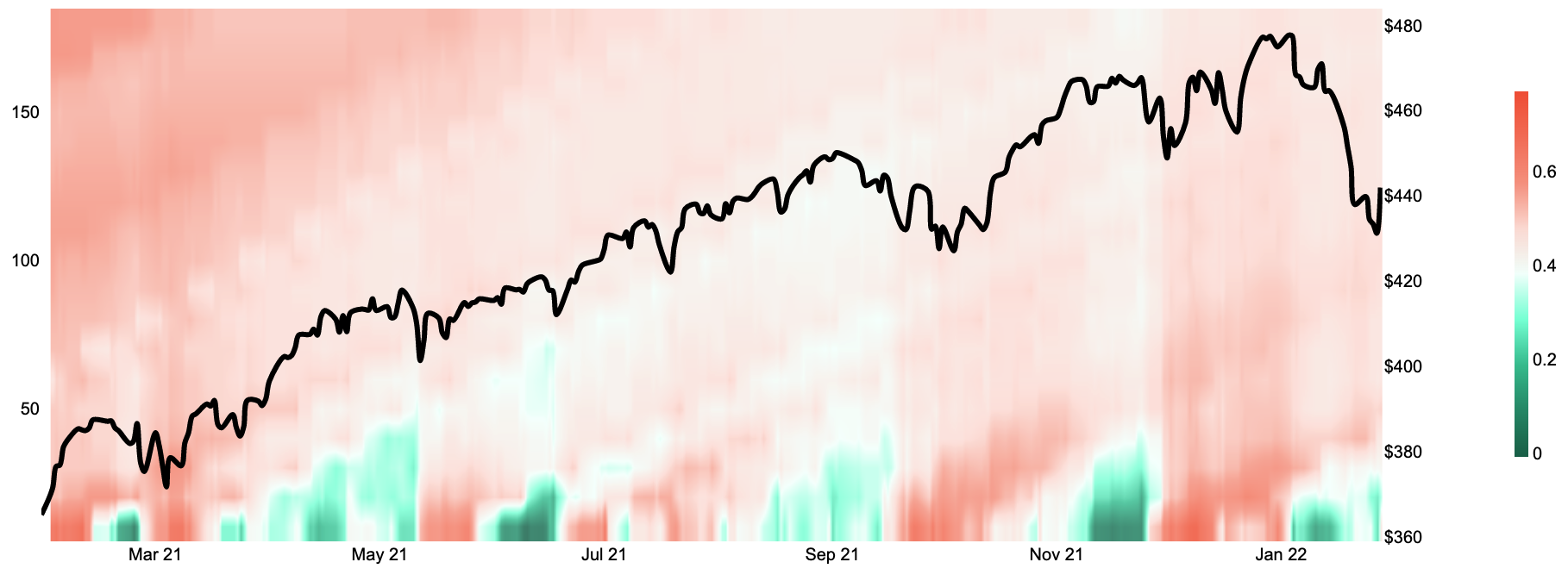
Quickly. What are correlations? They answer the question: is the variability of returns of group of assets linearly related? The backdrop for today’s correlations is shown below on our S&P500 Average Sector correlation heatmap. The left hand axis represents a correlation lookback period starting at 10 days (bottom), and going to about 180 days top). The price of the SPY etc is overlaid and displayed as the right hand axis. The level of correlation for each loopback period is shown in the heat map with green being (relatively) low correlation and red being (relatively) high correlation. In 2021 low-correlations preceded short-term market turbulence. In 2022, market-turbulence is co-incident with low correlations (notice the green and white shading we are currently observing in the lower right of the chart of the).
S&P500 Average Sector Correlation Heatmap
Before we go further into the analysis, lets provide a bit of a backdrop on correlation, and volatility — to who tracks them and why are they used in practice…?
How are Correlations Used
Until the mid 1990’s risk management was relatively unheard of amongst large corporations and there was a flurry of companies reporting outsized “CLM” (Career Limiting Move) losses. In February of 1993, Showa Shell Sekiyu oil company of Japan lost USD $1.05 billion from FX trading. In December of that same year MG refining and Marketing of Metallgesellschaft AG, a German company lost USD $1.3 billion from botched hedging of oil sales. In 1994, Kashima Oil of Japan lost USD $1.5b from FX trading. Similarly in 1994, the “OC”, California’s Orange County lost USD $1.7 billion on repos. Some incredible losses indeed, but perhaps the most bewildering of all was the collapse of Barings Bank caused by rogue trader Nick Leeson (Nick personally lost USD $1.4 billion and caused the collapse of the +200 year old Bank (founded in 1762). So… what do all these losses have to do with correlations and volatility!?!?. This string of CLM losses created a significant spike in interest in risk management throughout industry and were partially responsible for the public release of J.P Morgan’s service Risk Metrics. Risk Metrics allowed JPM’s subscribers to upload their positions to compatible service providers, who would then calculate a one day 95th percentile loss for the subscriber. This was metric is known as Value at Risk. To translate into simple English, Risk Metrics would calculate the one-day loss which a trader, firm etc. could expect *just* 5% of the time. The main inputs to J.P. Morgan’s Risk Metrics subscriber service were correlations and volatilities.
When writing this post, we momentarily pondered whether correlations could be interpreted as a distillation of investor sentiment, to which we immediately concluded, absolutely. In a Bloomberg interview from 2017, Dr. Brett Steenbarger who has worked with some of the world’s largest hedge funds, notes that, “…the greatest challenging facing traders, investors, investment firms is the correlation among their performers. People are looking at the same things, putting on the same trades, developing the same investment ideas.” So what does this mean and how does this translate to the public markets as a whole? Let’s let Dr. Brett answer that one as well, “…we tend to get high correlations during and immediately after periods of market correction, as traders and investors bail out of risk assets and then back into them. At relative price peaks in markets, especially when volatility has been lower, the average intermarket correlations have been lower. This is a rough look at an important phenomenon, as it captures portfolio-related decision making across a broad range of assets. Only large institutions can affect these correlations, which makes the average correlation a useful tool in gauging the sentiment of active money managers.” Great, now we know exactly how and why correlations are a distillation of investor sentiment, let’s transition into the analysis.
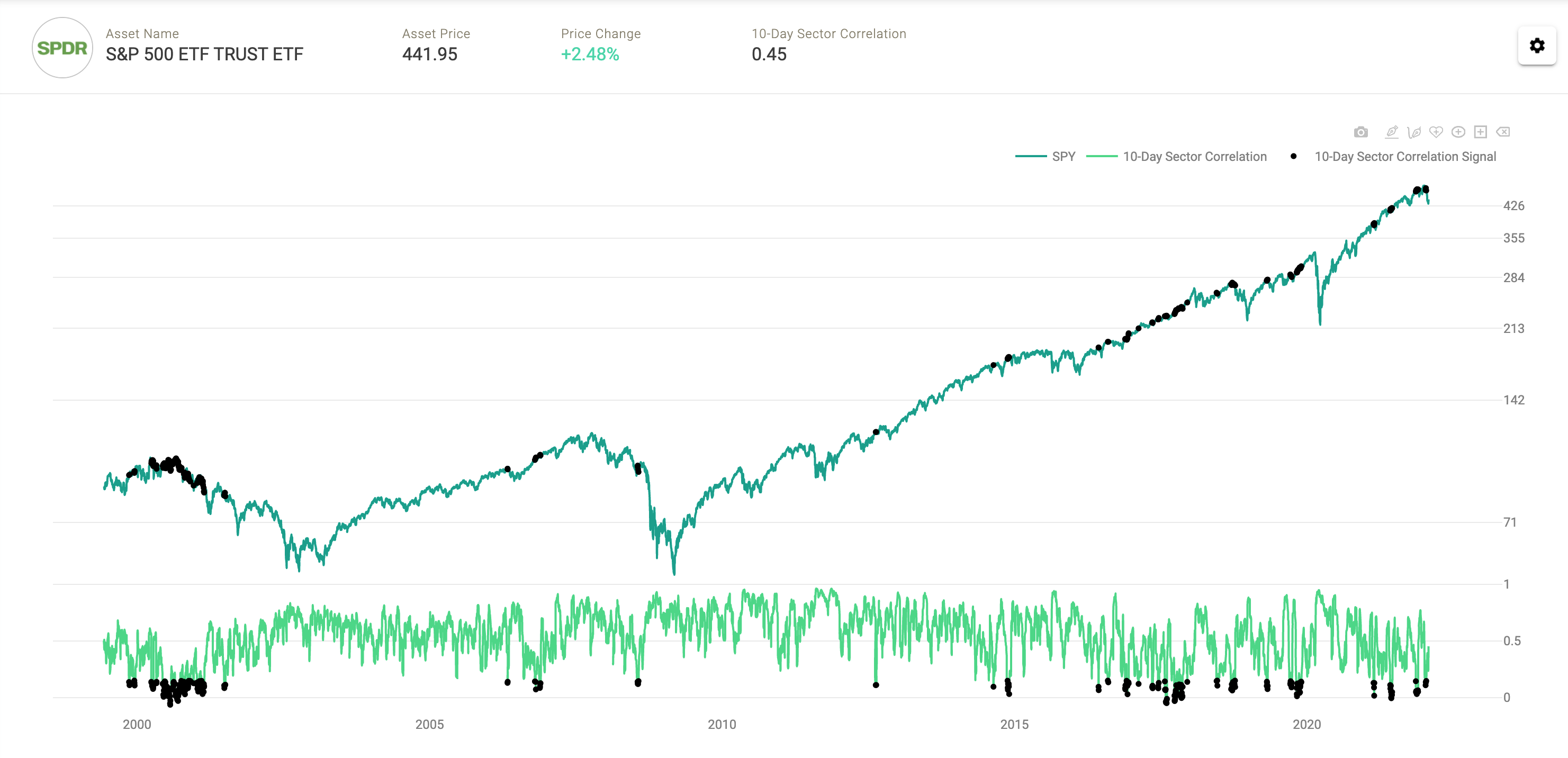
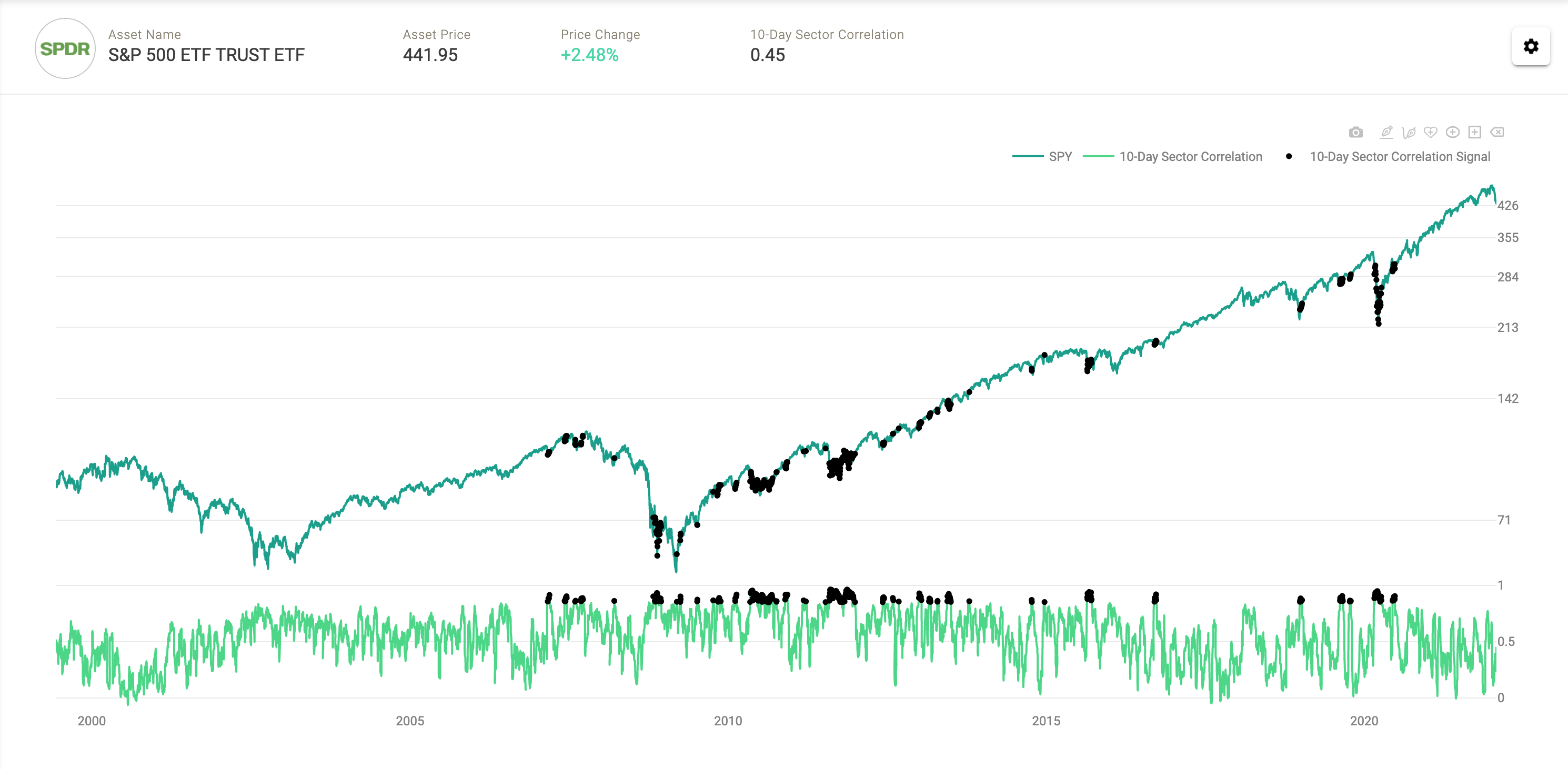
Now, if we think about the average market index and the constituents that drive its performance, we can determine our own Value at Risk metric. To do this for the S&P500 we use the individual sector constituents. In particular, we calculate average ten-day S&P500 sector correlations on a daily basis. This allows us to determine SPY price ranges (aka VaR) as well as to classify market regimes and risk / return profiles. This calculation methodology is dubbed a “historical simulation”. Below we show that low correlation regimes exhibit relatively lower volatility, while high correlation regimes exhibit relatively higher volatility.
Correlations Filtered Between -1 and .15
Correlations Filtered Between .85 and 1
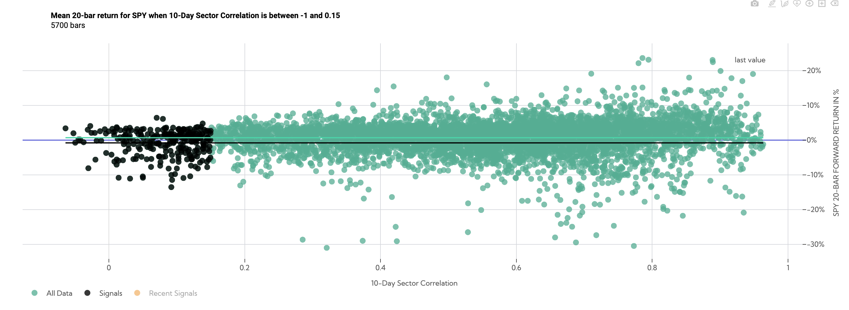
Over the following 20 days, low correlation datapoints (filtered between a correlation of -1 and .15) returned -.80% on average (black line) compared to SPY anytime returns of .70% (green line).
SPY 20-Day Forward Return Scatter (Average Sector Correlation between -1 and .15)
SPY 20-Day Forward Return Probability Distribution Comparison (Average Sector Correlation between -1 and .15)
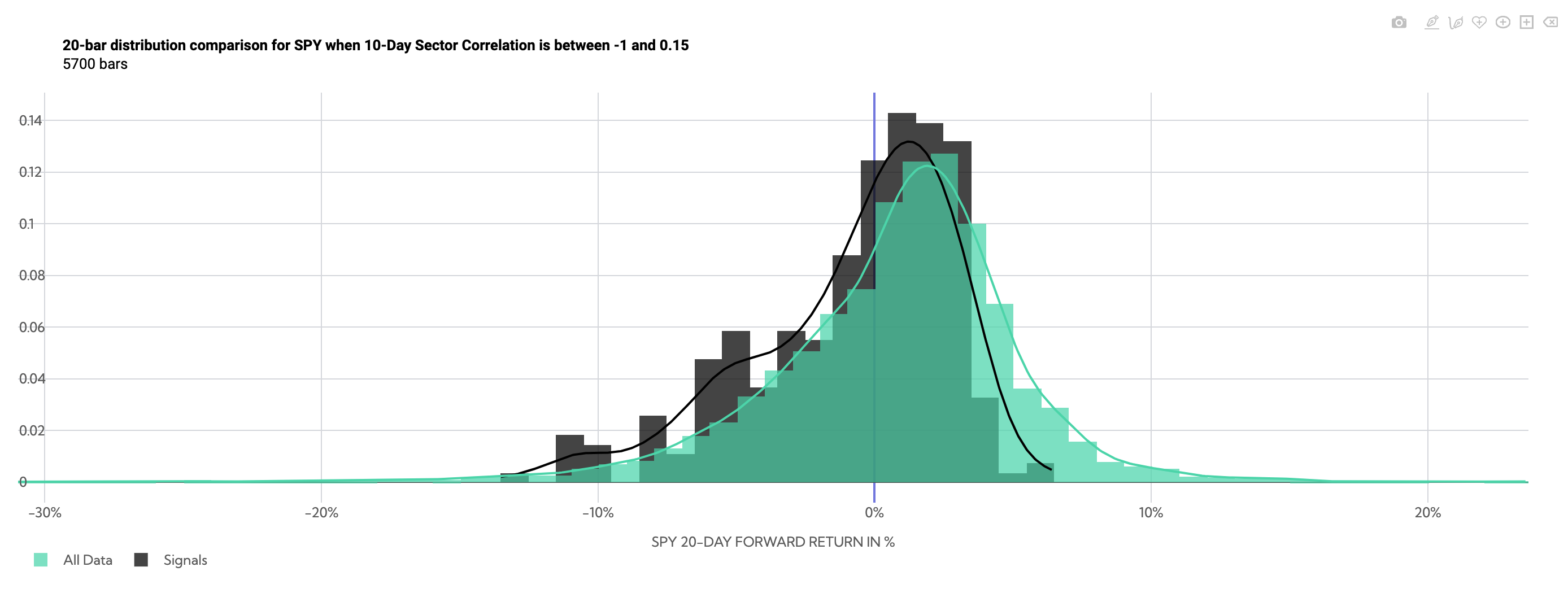
There is a negative skew, but low volatility. The standard deviation of returns over that 20-day period has been 3.85% historically, compared to 4.73% looking at anytime ~20-day SPY returns.
Summary Table of SPY Returns (Average Sector Correlation between -1 and .15)

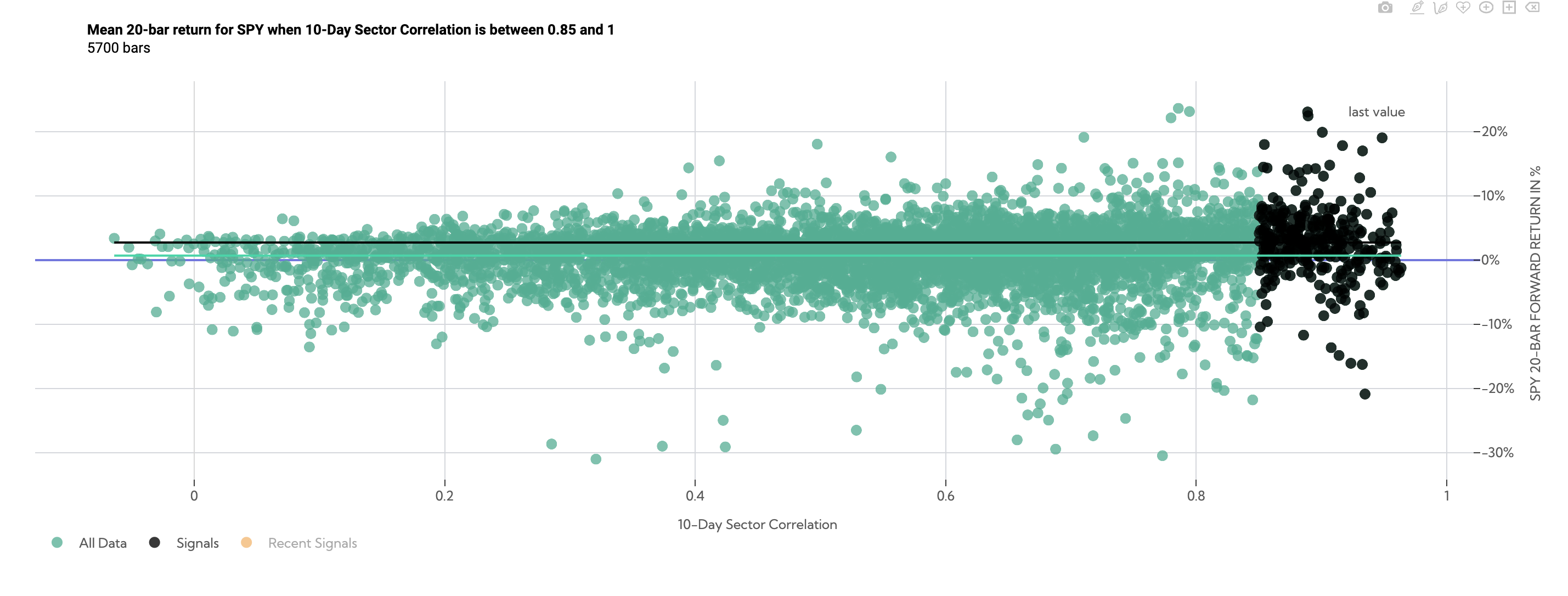
Conversely high correlation datapoints over the following 20 days (filtered between a correlation of .85 and 1) returned 2.73% on average compared to SPY anytime returns of .81%.
SPY 20-Day Forward Return Scatter (Average Sector Correlation between .85 and 1)
SPY 20-Day Forward Return Probability Distribution Comparison (Average Sector Correlation between .85 and 1)
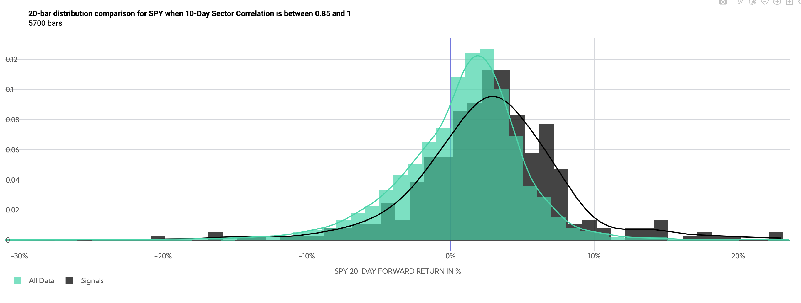
Returns now tilt positive, but with high volatility. The standard deviation of returns over that 20-day period has been 5.34% historically, compared to 4.73% looking at anytime ~20 day SPY returns.
Summary Table of SPY Returns (Average Sector Correlation between .85 and 1)

So… what does this tell us about risk and reward. Since we’ve already established that low correlation is general consistent with lower realized volatility, we should be able to see that as well on a 60-day forward return price path.
SPY Historical Returns Day 1-60 (Average Sector Correlation between -1 and .15)
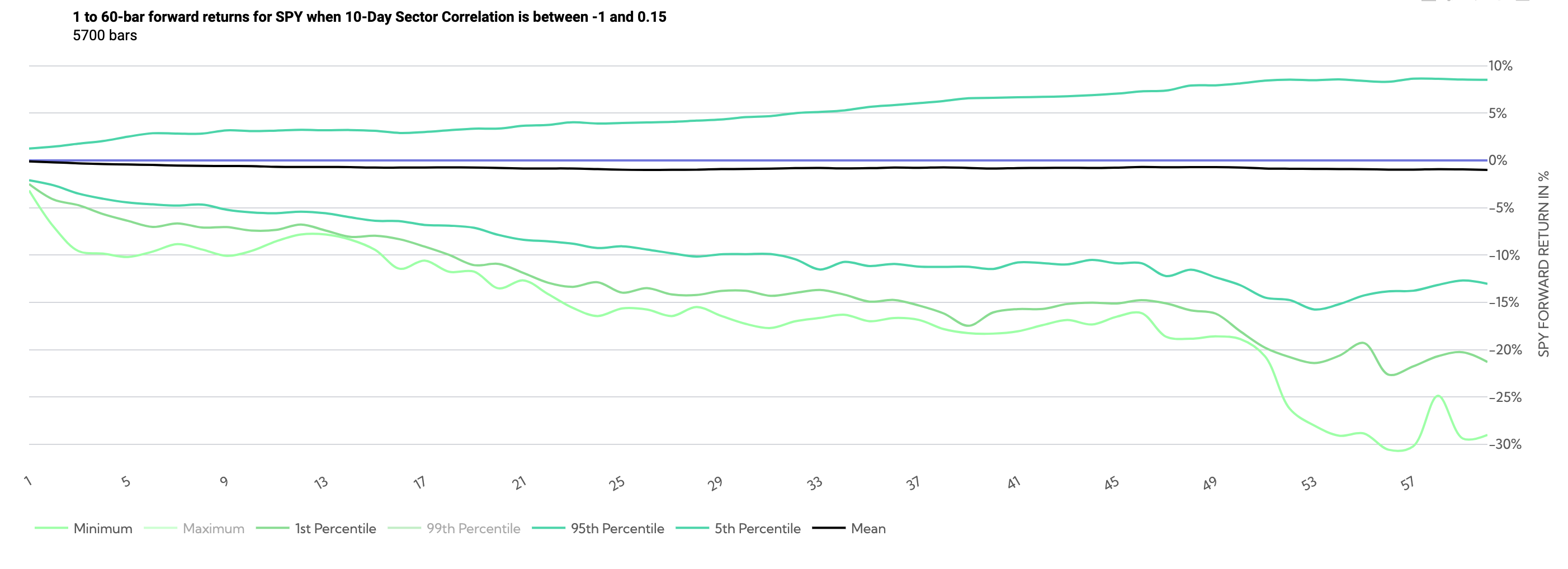
The above chart shows the price path (overlapping) when correlations are low. By day ~20, the minimum return and 1st percentile returns have both been under -20%, with the 5th percentile return well under 10%.
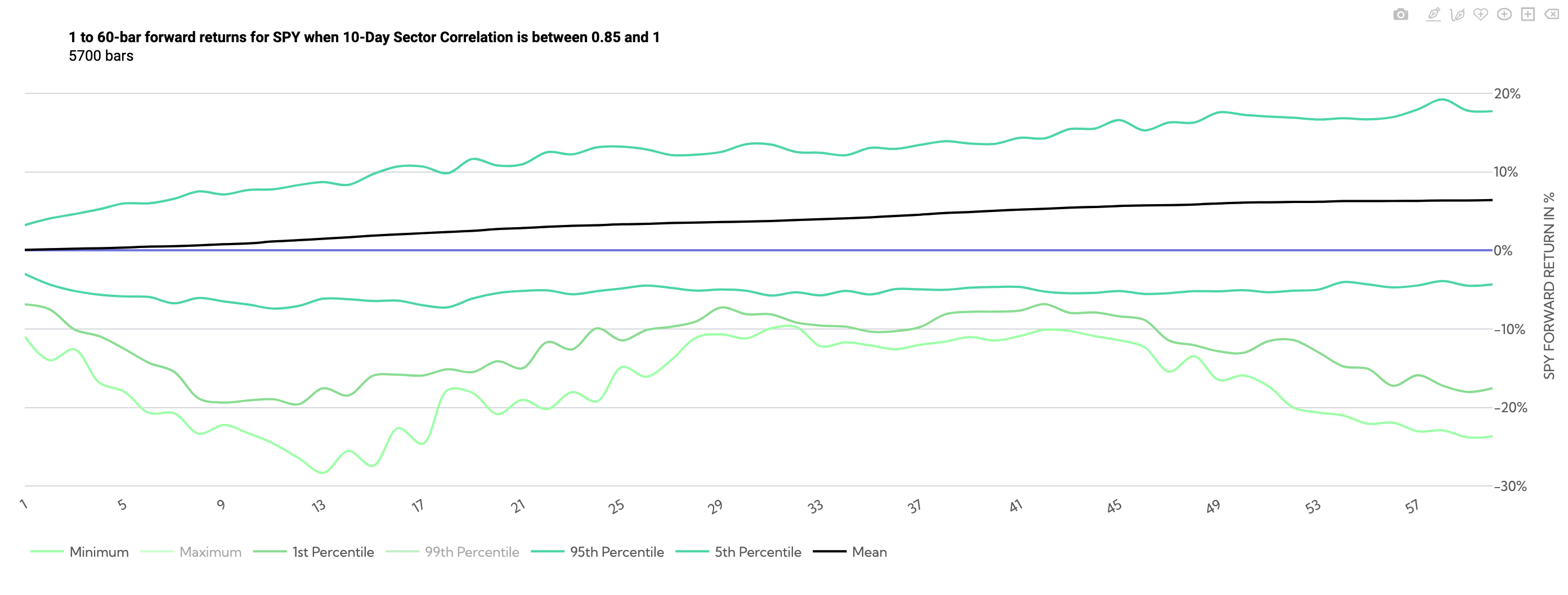
Conversely the chart below shows tail risk opens up when correlations are high. While the 5th percentile is well under 10% across all timeframes, the 1st and minimum reach and exceed -20% respectively, by about day 8.
SPY Historical Returns Day 1-60 (Average Sector Correlation between .85 and 1)
Where does that leave us?
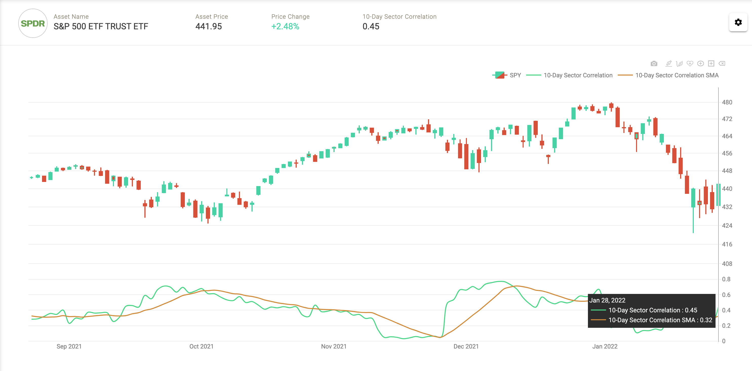
So where does that leave us today? During the sell-off thus far, correlations have been persistently low. When we traded nearly 10% off ATH’s on January 24th the 10-day moving average of the S&P500 Sector correlations was just .24, thus we do not think we are making an error in estimating correlation. This is highly unusual for being so deep into a correction. As of market close on the 28th, the 10-day moving average was .32, not much higher despite the highest realized volatility on the S&P500 since July of 2020.
S&P500 Average 10-Day Sector Correlations with 10-SMA overlay
So, what is simple way to visualize this relationship historically… and is this indeed rare? A scatter plot will do just fine. Let’s put average 10-day average sector Correlation’s on the X axis and realized volatility on the Y axis.
10-Day S&P500 Average Correlations Vs. Realized Volatility
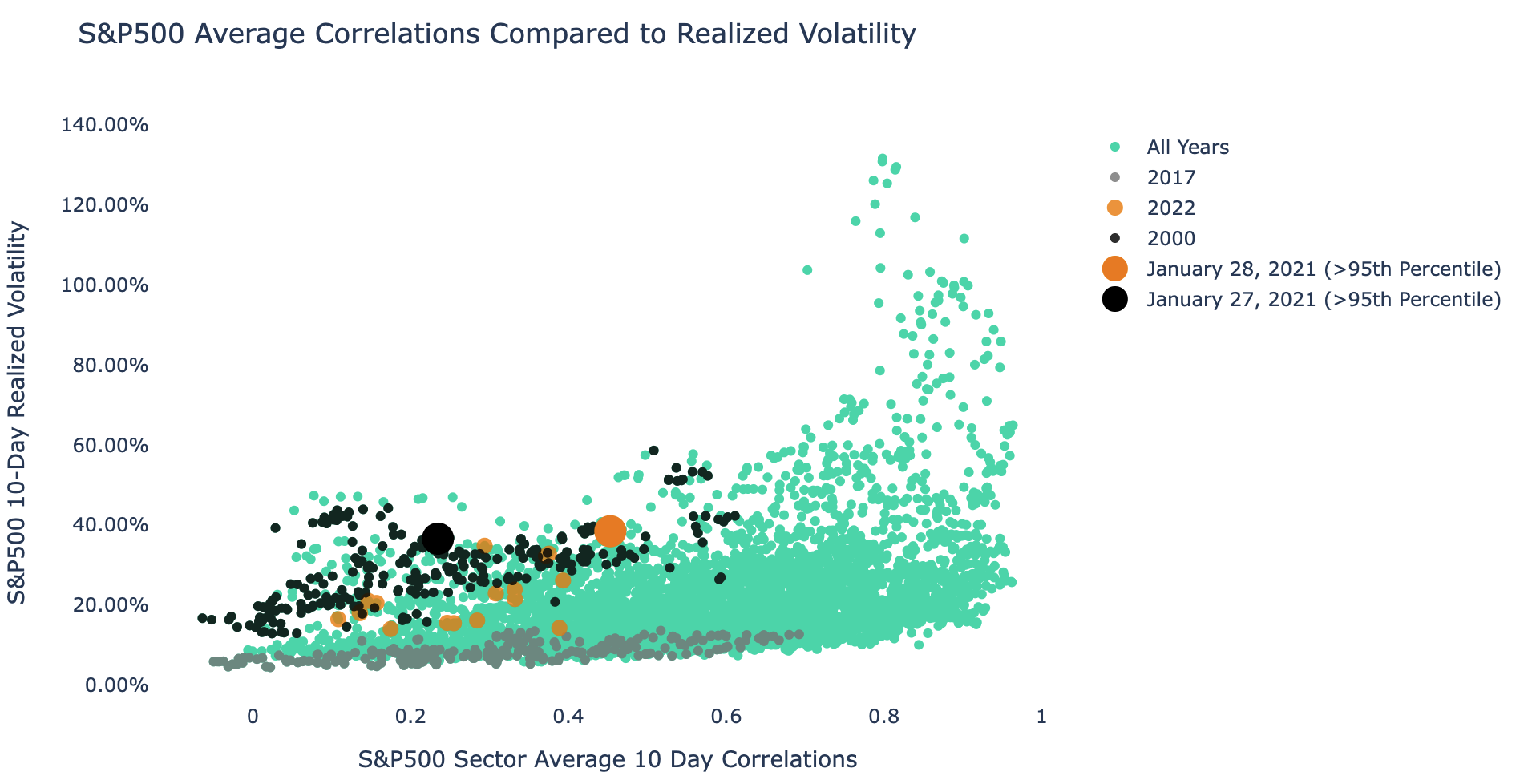
In green dots you have every single datapoint of the relationship historically, going back to early 1999.
- The 2000 period relationship is highlighted in black dots (where we had low correlation but high volatility).
- The 2017 period is highlighted in grey dots (where we had low correlation and ultra-low volatility).
- YTD 2022 is highlighted in orange dots. It is safe to say the relationship between realized volatility and correlation is a lot more like 2000 than it is like 2017.
- January 28th and 27th are highlighted in large orange and black dots, both of these dates exceeded the 95th percentile in terms of realized volatility for their respective correlation bands (correlation between -1,.45 in this case). This mirrors many of the extremes we saw in 2000.
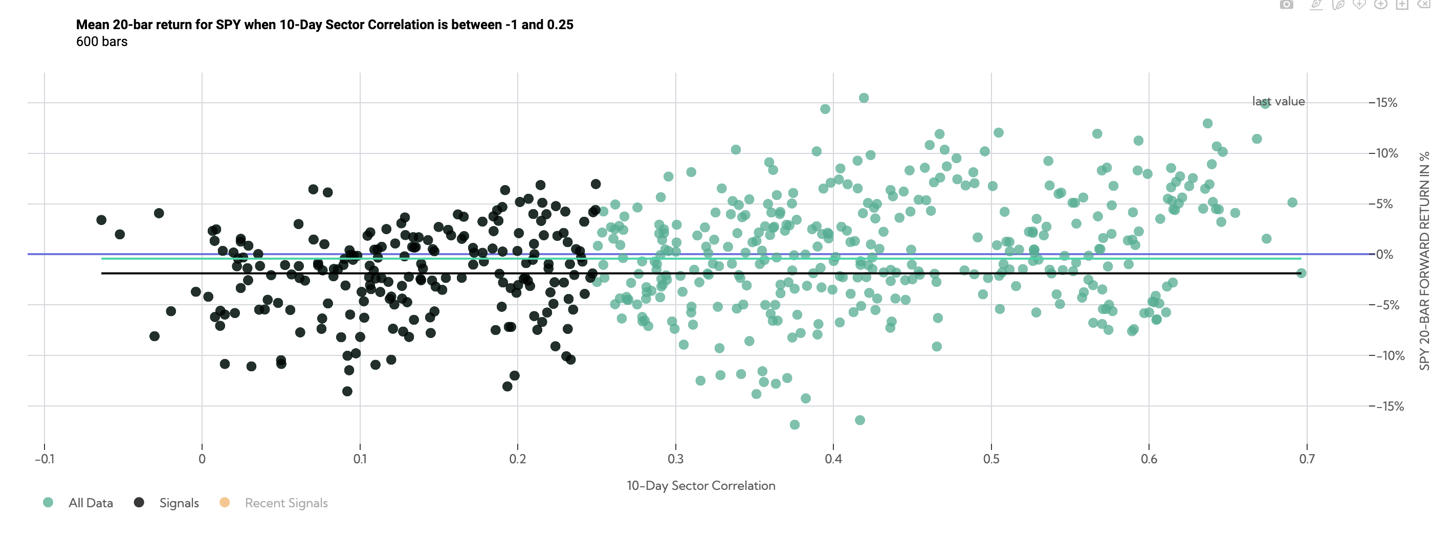
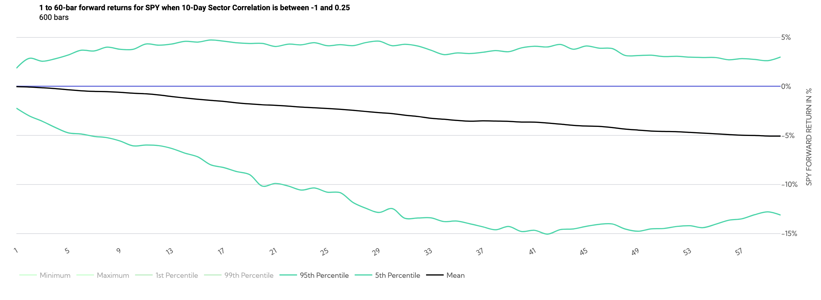
Isolating the year 2000 1 month forward returns on the $SPY we can see they are even weaker than normal returns during that same period. Where the SPY on average returned -.30% over the next month, the low correlation periods returned -1.88%.
SPY 20-day forward returns during the year 2000 (Average Correlation between -1, .25)
Conclusion
Our Analysis suggests that, while it appears unlikely the S&P500 will fall off a cliff like in 2020, there appears to be fragility in the market, very similar to the year 2000. Managing risk should be top of mind.
Some potential limitations of this analysis as well as future considerations:
- A very short lookback period was used in this analysis to evaluate correlations, this short lookback period means the analysis is prone to estimation error.
- Overlapping data – the analysis does not use independent non-overlapping data points, thus the returns clustered from overlapping points.
- Average correlations are only one data-point and alone do not capture the complexity of the ever changing market.
- While the data backdrop is very similar to the year 2000, technology has changed dramatically. There is an unprecedented amount of retail traders commanding large options positions that may have market moving potential. Are retail traders now able to influence market volatility and correlation @squeezemetrics ?
If you found this post valuable please give it a share by clicking the tweet button below, and follow me on Twitter @halferspower. Thanks a lot!
Average Sector Correlations: The Spectrum of SPY Forward Returns and Volatility.
Tweet
